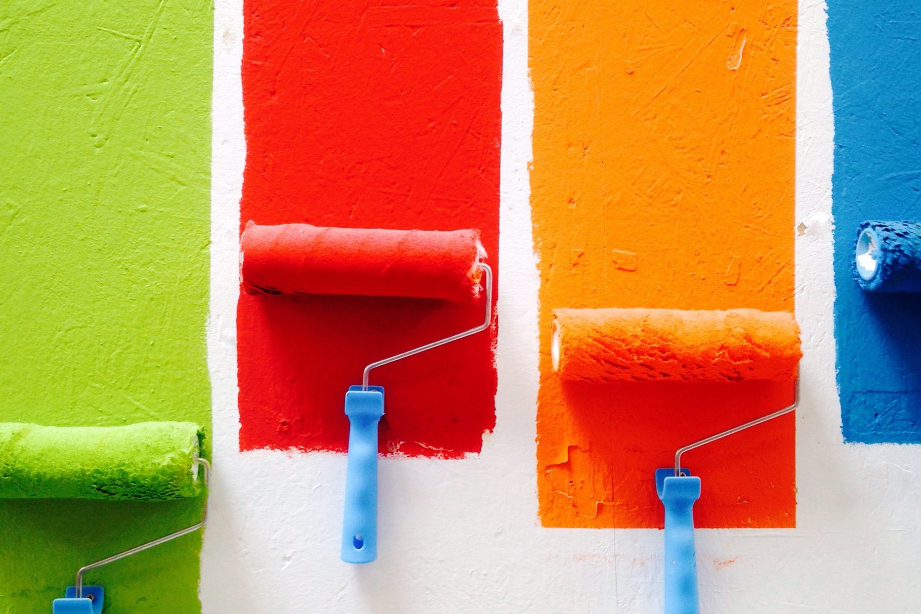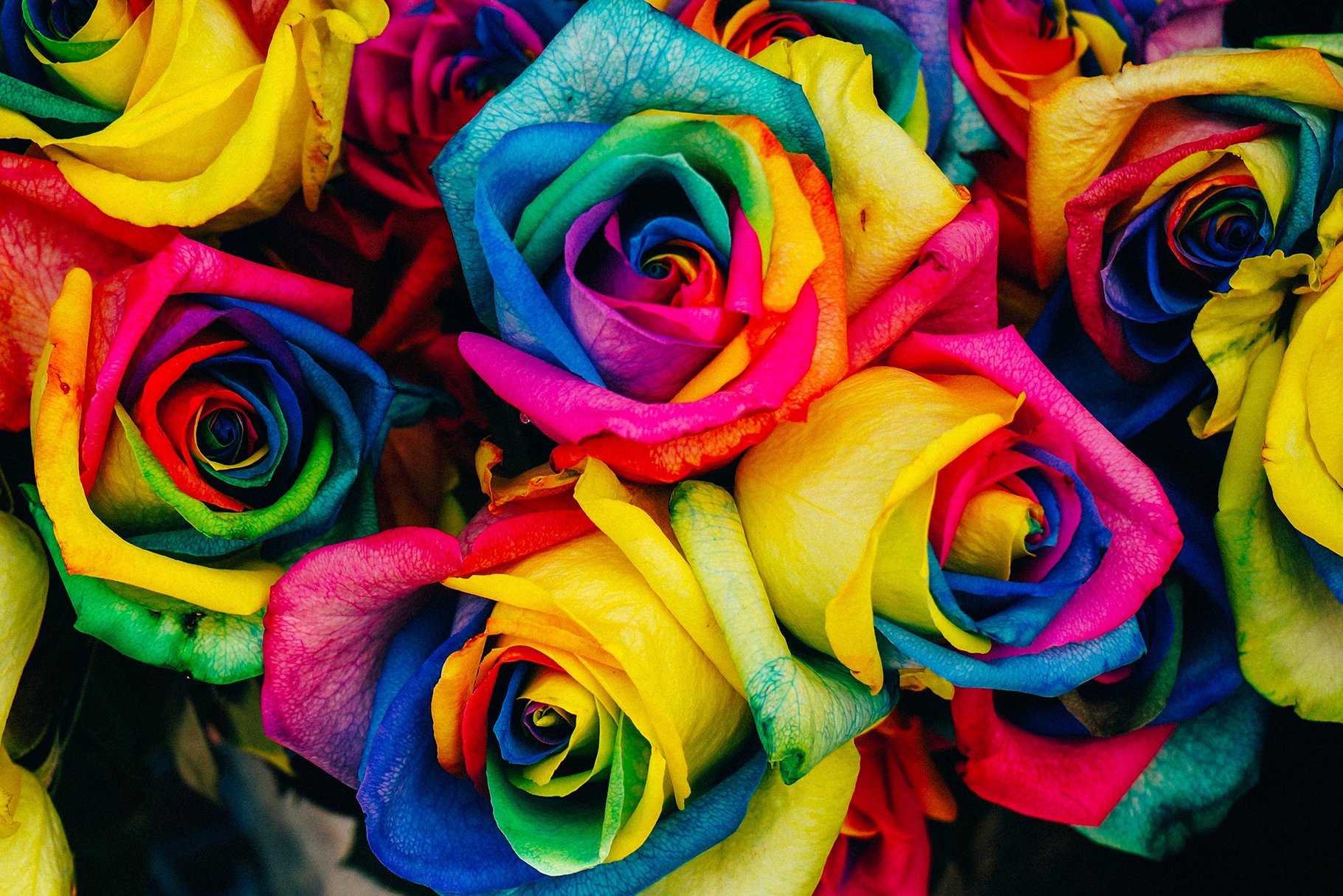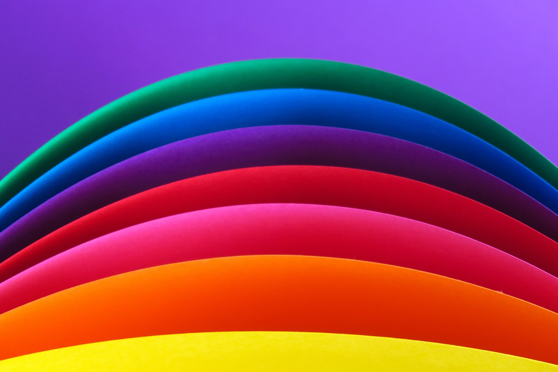
The contrast in graphic design is a principle that can improve a design by a lot. When talking about contrast, it merely means that you have two different elements on a page. If you want to ensure that a design has proper contrast, you need to look for two or more elements that are entirely different from each other.
Contrast can be found in many things, such as element size, color, texture, shape, or typography. One of the most popular methods of contrast is color contrast since it’s constantly used to make an element stand out from another.
Why is Color Contrast Important in Graphic Design?
Color is one of the essential items that you can use to improve a design. It’s consistently used to give more organization or emphasis to a specific object. A subtle change, such as changing the color from one element to another, can make people shift their attention to the element or information that you want them to look at.
However, the main benefit of color contrast is that it looks more attractive to the eye. Having a design in which all the elements look the same can be dull to some people, so it’s nice to make your design more dynamic.
For example, if you want a design that showcases the overall benefits from a product, you can use contrast to make people look at what you want. In that case, you can use a bright, dynamic color for the object that you want to draw attention to, and more subtle color for the background.

Organize Your Content Better
If all the elements on your design look exactly the same, it may be complicated for viewers to tell what your focus or intention is. You can use contrast to make essential elements stand out and leave the other elements as a background.
In addition to making the design more attractive, color contrast can help to reinforce your idea and to create a hierarchy in your design. This means that you can use color to rank the importance of every element in your design. You can use this to draw attention to certain parts without explicitly telling the viewers where to look.

Types of Color Contrast
There are seven main types of color contrast, and each one does a slightly different job. Therefore, keep that in mind when creating your design.
Color Hue
Color Saturation
Color Temperature
Color Simultaneity
Color Extension
Color Complements
Dark and Light Colors

Final Thoughts
Creating a color contrast in your designs can make your design look more dynamic and creative. However, keep in mind that in graphic design, every element has to serve its purpose correctly. When creating color contrast, make sure that it’s improving your design, and not making it difficult to understand.
